
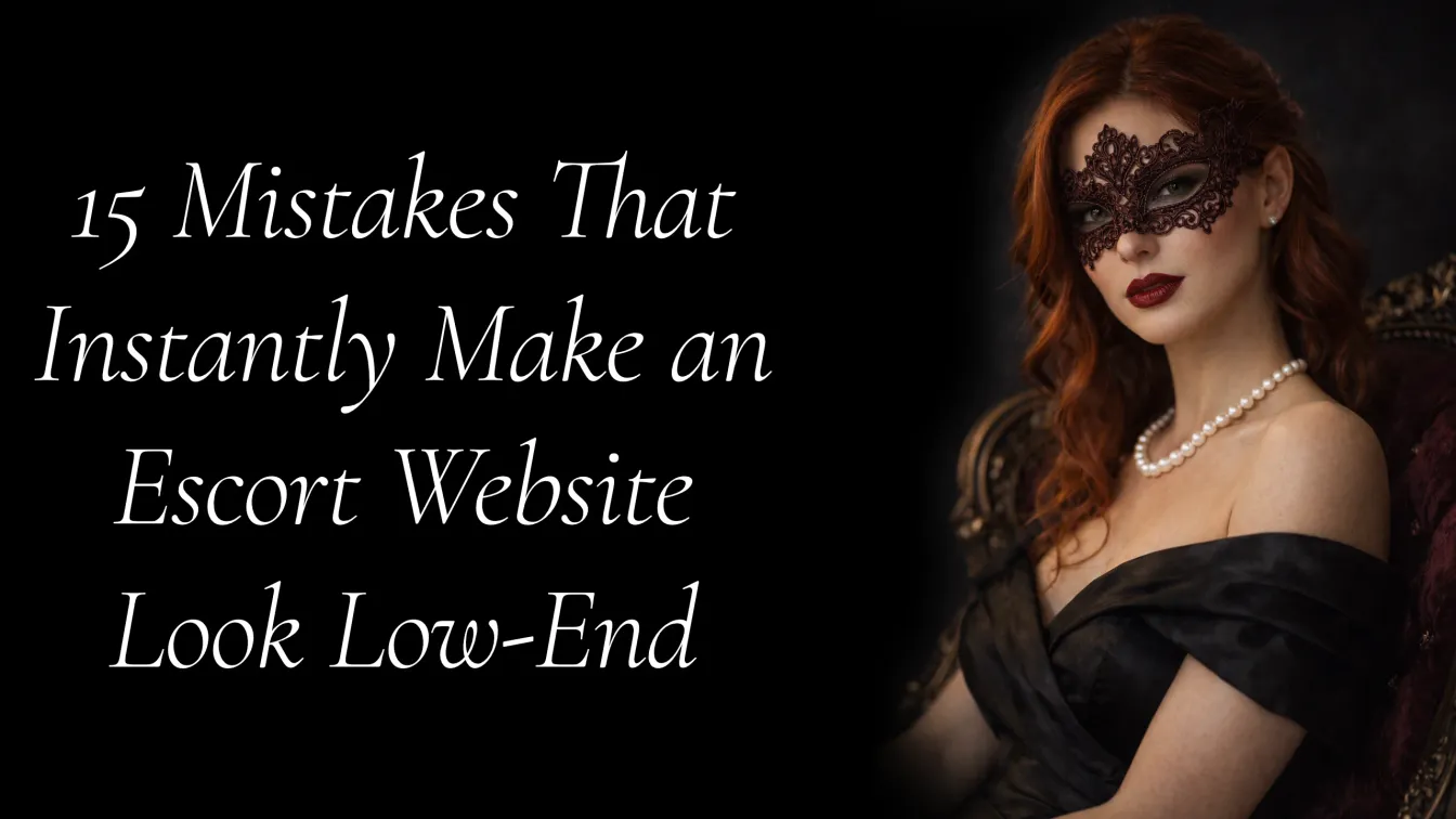
There is a moment, it lasts about 50 milliseconds, where a prospective client opens your website and makes a decision. Not a conscious one. A gut one. Research from the web design industry confirms it: visitors form a first impression of a site in under a tenth of a second, and 94% of those first-impression assessments are driven entirely by design. That is before your copy loads. Before your rates are visible. Before they read your bio.
If your website reads as low-end in that moment, the client is already gone.
This is what we call the Prestige Gap — the invisible distance between how your website presents itself and what a high-value client expects to see. The gap is rarely created by one catastrophic failure. It is created by an accumulation of small, quiet mistakes that individually seem harmless but together signal exactly the wrong thing.
The frustrating part is that most of these mistakes are fixable. But you cannot fix what you cannot name.
Here are 15 of them.
1. Generic Stock Photos That Look Like Everyone Else’s
This is the fastest way to signal that you did not invest in your own brand. When a client lands on your homepage and sees the same posed, overly lit, emotionless stock image that appears on three competing sites, their brain immediately categorises you as interchangeable.
High-end clients are not shopping in bulk. They are selecting. Selection requires differentiation. Stock photography, especially the category of it that most escorts use, communicates nothing that is uniquely you.
The fix is not simply “use better photos.” It is “use photos that are yours, that carry your energy, your aesthetic, your context.” Atmospheric. Considered. Consistent in tone across every page.
What high-end clients expect from a luxury agency website goes beyond the visible — but the visible is always the entry point.
2. Color Choices That Fight Each Other
Color is not decoration. It is communication. A clashing palette — neons against pastels, three competing accent colors, a header that is dark red over a pink background — tells the visitor that no one with design training made this site.
Luxury visual identity typically works within a tight color system. Two to three colors maximum. One dominant. One accent. One neutral. The accent is used sparingly, which is exactly what gives it power. When everything is an accent, nothing is.
If you are unsure about your current palette, look at how brands like Net-a-Porter, Celine, or The Line Hotel present themselves online. Notice the restraint. The confidence in whitespace. That restraint is a deliberate signal.
3. No Visual Hierarchy on Key Pages
Visual hierarchy is the order in which a visitor’s eye moves through a page. When it is absent, the eye does not know where to go and the brain interprets this as confusion — which it then maps onto the brand.
On a luxury escort website, this typically shows up as:
- Headlines that are the same size as body text
- Photos competing with copy for dominance
- Call-to-action buttons buried below the fold or styled to disappear
- Testimonials, rates, and bio content all formatted identically
A well-structured page leads the eye deliberately: large hero image or statement, a clear headline, supporting context, social proof, and a single, visible action to take next.
If you want to understand how this works at a conversion level, the anatomy of a high-converting luxury escort homepage breaks it down in practical detail.
4. Copy That Talks About You Instead of to the Client
This is one of the most common and most damaging content mistakes in the escort space. The homepage opens with “I am a sophisticated companion offering…” and continues for three paragraphs describing the escort, not addressing the client.
High-end clients read “I am” copy and feel the distance in it. It positions you as someone seeking approval rather than someone who understands them. The shift from “I am” to “you will” changes the entire psychological register of the page.
Compare:
“I am an elegant brunette with a passion for fine dining and travel…”
with
“You will find someone who understands the difference between company and presence.”
One is a resumé. The other is a signal of emotional intelligence.
Your copy should make the right client feel seen and the wrong client understand this is not for them. Both outcomes protect your positioning.
5. A Thin or Generic About Page
The About page is where trust either forms or fails. And yet most escort websites treat it as an afterthought — two paragraphs of adjectives (“sophisticated,” “sensual,” “educated”) that say nothing differentiated.
Personal branding for escorts is not about oversharing. It is about giving the right client enough of a real signal that they feel they know who they are contacting before they contact you. Specific interests. Real places you love. A perspective on something. The texture of an actual personality.
A Stanford Web Credibility Research study found that detailed, specific “About” content is one of the strongest trust indicators on a professional services website. Vague, generic bio copy does the opposite — it creates suspicion.
6. Slow Page Load Speed
75% of visitors consider a slow website to be untrustworthy. A one-second delay in load time reduces conversions by 7%. Websites that take over two seconds to load lose up to 60% of their visitors before the page even renders.
A high-value client who has just had a productive day, is considering how to spend a significant sum, and navigates to your website on their phone — they will not wait for your hero image to load. They will press back. They will open the next result.
Page speed is not a technical concern. It is a first-impression concern. A luxury hotel’s website loads in under two seconds. Yours should too.
7. A Website That Breaks on Mobile
Almost two-thirds of global web traffic now comes from mobile devices. 57% of consumers say they will not recommend a website that is not mobile-friendly. More relevantly, 84% of users who have a poor mobile experience form a negative impression of the business overall.
Most escort website enquiries originate on mobile. If a prospective client pinches and zooms to read your rates, or if your contact form does not work on Safari, you have already communicated something about the level of care you take with details. That impression transfers directly to how they imagine you operate in other areas.
8. Cluttered Navigation That Creates Confusion
Navigation should do one thing: move people toward contact. Every additional menu item that does not serve that goal is friction.
Low-end websites typically have navigation overload — Rates, Gallery, Gallery 2, Blog, FAQ, Testimonials, Contact, Bookings, Links — each one a micro-decision the client has to make before they can do anything. The anxiety this creates is subtle but real.
Luxury websites simplify. Five navigation items maximum. Each one deliberate. The goal is to make the path to enquiry as frictionless as possible, because what makes a client feel safe enough to reach out is often about removing every unnecessary barrier, not adding more content.
9. No Social Proof or Weak Social Proof
80% of online users are more likely to engage with a website that carries genuine testimonials. In the luxury escort space, this matters even more because the decision to contact is high-stakes and the cost of a wrong choice is significant — for the client.
The mistake is not just the absence of testimonials. It is also weak testimonials: “Great experience!” with no name, no context, no specificity. High-value clients are trained to read generic praise as placeholder content.
Specific testimonials work. “He booked again three weeks later” works. A single, precise, believable sentence outperforms five vague superlatives every time.
As Dr. Robert Cialdini’s research on social proof consistently shows, the more specific and verifiable a testimonial, the stronger its persuasive effect. This principle applies across industries, including the luxury companionship market.
10. A Weak or Missing Call to Action
You have their attention. Your design is clean. Your copy is good. And then the page ends with… nothing. Or with a contact link buried in a footer. Or a form that asks for ten fields before they can even say hello.
A call to action is not just a button. It is a signal of confidence. “Enquire now” says you expect to be contacted. “Request a consultation” says this is a curated experience worth requesting.
Why your escort website gets traffic but no enquiries often comes down to exactly this. The visitor intended to contact you. The site did not make it obvious how. The moment passed.
One clear, visible, well-worded call to action per page. That is the standard.
11. Inconsistent Branding Across Pages
When your homepage feels like one brand and your rates page feels like another — different fonts, different photo editing styles, different tone of voice — the overall impression is that the site was assembled rather than designed.
High-end clients do not consciously notice inconsistency. They experience it as unease. Something feels off. They cannot place it. They leave.
Brand consistency is about coherence — the sense that every element of your online presence was made by someone who had a clear intention and held it across the entire experience. How independent escorts can create a signature online identity explores this in depth, but the short version is: your fonts, your photo treatment, your copy tone, and your color use should all feel like they came from the same person, because they did.
12. No SSL Certificate or Visible Trust Signals
If your website URL begins with http:// instead of https://, most browsers now display a visible warning to visitors. Even if they do not see the warning, the Not Secure label in the address bar is enough to terminate the session for a privacy-conscious client.
Beyond SSL, trust signals include: a professional domain (not a free subdomain), a clearly visible contact method, consistent business name across all platforms, and a professional email address. Using a Gmail address for client enquiries on a luxury website is a detail that costs you credibility you cannot easily recover.
Why discretion is one of the strongest marketing advantages in luxury escorting covers how trust is communicated before a single word is exchanged — and these signals are part of that architecture.
13. Outdated Design Elements That Date the Site
Gradients with hard edges. Drop shadows that look painted. Fonts that were modern in 2012. A rotating image carousel on the homepage. Animated text that types itself out. These are not just aesthetic problems. They are temporal signals that tell the visitor: this website was not looked after.
A luxury hotel that has not updated its lobby in 12 years signals something about its standards. Your website communicates the same thing. High-end clients live in environments of constant visual quality — luxury brands, premium hospitality, curated interiors. They calibrate quickly.
The standard to measure against is not “other escort websites.” It is the aesthetic standard of the industry your target clients move in every day.
14. Poor Typography That Makes Reading Difficult
Typography is invisible when done well and painful when done badly. Low-end websites make several consistent typography errors:
Body text too small to read comfortably on mobile (under 16px). Line height too tight, creating a wall of text. Font choices that carry the wrong register — a site claiming luxury but using Comic Sans or an overly casual sans-serif undercuts every other signal.
Luxury typography is generous. It uses whitespace as an active design element. It pairs a refined display font with a legible body font and applies both with discipline. The reader never has to work.
15. No Clear Positioning — You Look Like Everyone Else
This is the most expensive mistake on this list. And the hardest to see when you are inside it.
If your website could have been made for any of 50 other escorts in your city — if there is nothing that immediately communicates who you are, what makes you distinct, and who your ideal client is — you are not competing on quality. You are competing on price.
High-value clients are not looking for the best available option. They are looking for the right one. The right one feels specific. It feels like a match rather than a selection.
How high-end escorts build a brand that attracts premium clients gets into the mechanics of this. But the foundational principle is simple: positioning is not what you say about yourself. It is the clear, consistent answer to the question “why you, specifically?”
If your website does not answer that question in the first ten seconds, you are invisible in the way that matters most.
What the Prestige Gap Actually Costs You
The Prestige Gap is not theoretical. It has a measurable cost.
Every client who lands on your website, reads it as low-end, and leaves without enquiring represents lost revenue. 88% of users who have a bad experience on a website do not return. They do not email to tell you. They do not leave a comment. They simply move on to a website that signals what they were looking for.
Because the luxury escort market is not volume-driven, each lost enquiry carries disproportionate weight. A single retained client at the luxury tier is worth multiples of what several low-end bookings generate. The difference between a website that converts at this level and one that does not is almost never the traffic. Why luxury clients judge your website before they ever contact you comes down to the accumulated weight of small signals — and 15 of those signals are listed above.
The question is not whether your website has problems. Most do. The question is how many of these 15 mistakes are currently working against you, and how quickly you fix them.
If you want to know where your website stands, our services page outlines how Scarlet Pixel approaches this. Or if you want to talk through your specific situation, contact us directly.
References
Cialdini, R. B. (2009). Influence: The psychology of persuasion (Rev. ed.). HarperCollins.
DesignRush. (2026, January 23). The most important UX statistics in 2026: Business impact, benchmarks & growth levers. https://www.designrush.com/agency/ui-ux-design/trends/ui-ux-statistics
Hostinger. (2026, January 13). 28 essential web design statistics for 2026: Trends & insights. https://www.hostinger.com/tutorials/web-design-statistics
UXCam. (2025, March 31). 50+ powerful UX statistics to impress stakeholders 2025. https://uxcam.com/blog/ux-statistics/
WebFX. (2025, March 24). 40+ website statistics every marketer should know in 2026. https://www.webfx.com/web-design/statistics/
WiserNotify. (2025, December 25). 51 impactful branding statistics (new 2025 data). https://wisernotify.com/blog/branding-stats/
Frequently Asked Questions
How do I know if my escort website looks low-end?+−
Start by looking at it on your phone, through the eyes of someone who has never seen it. Does it load in under two seconds? Is the hierarchy clear? Does the copy speak to the client or about you? Does it feel consistent? If any of those answers are uncertain, that uncertainty is the answer.
Which of these 15 mistakes has the biggest impact on conversions?+−
Weak or missing positioning is the most expensive mistake because it affects how every other element is perceived. A client who cannot understand why they should choose you specifically will apply that uncertainty to everything — your photos, your rates, your credibility. Fix positioning first, then the others follow more naturally.
What is the first thing a luxury client notices on a website?+−
The image quality and overall visual register. Visitors form a design-based impression in under 50 milliseconds. This means the photo in your hero section and the general aesthetic of the first fold are doing most of the initial positioning work — before any copy is read.
Do I need to redesign my website entirely to fix these issues?+−
Not always. Some mistakes — like copy tone, call-to-action placement, and trust signals — can be corrected without touching the design system. Others, like visual hierarchy, typography, and color, usually require structural changes. A proper audit will tell you which category your issues fall into before you invest in fixes.